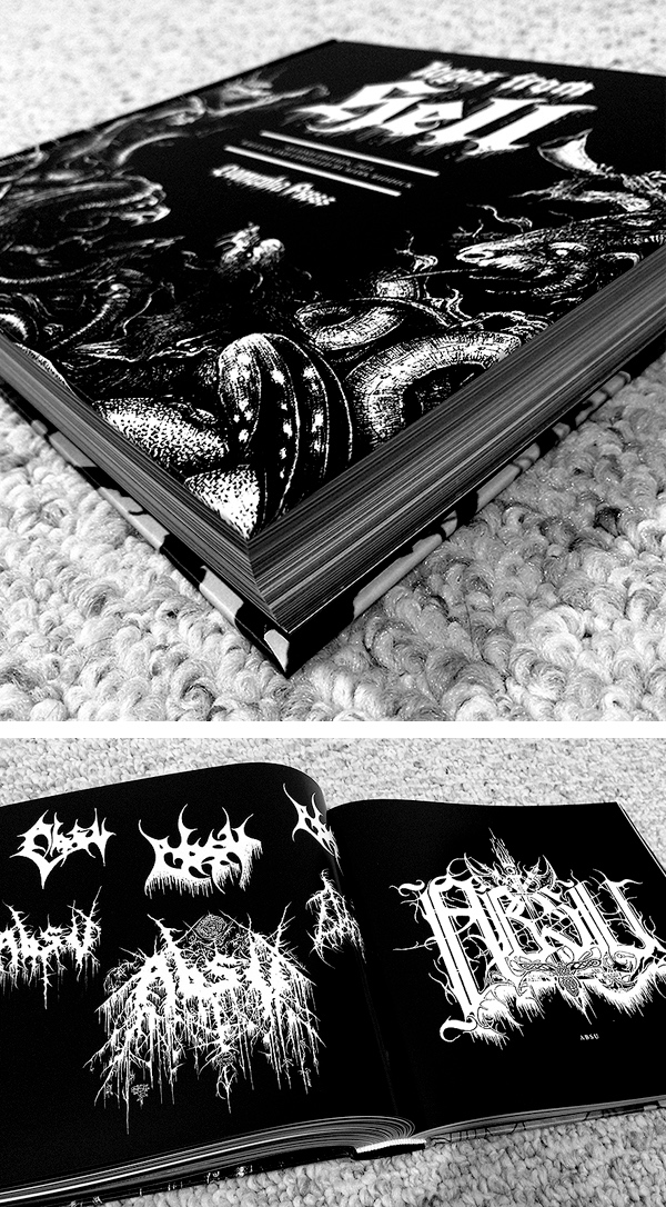
Logos from Hell is death metal illustrator/designer Mark Riddick's massive compendium of heavy metal band logos that he's gathered from across the globe. These are the sigils printed on foreboding LP jackets, scratched into school desks, scribbled onto notebooks, and inked into hesher arms the world over. From Wired:
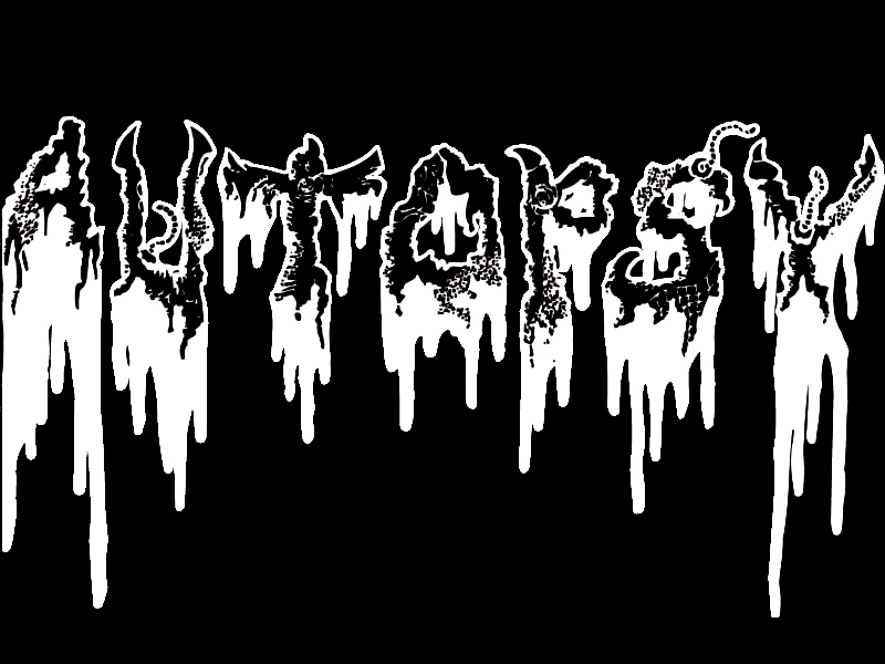
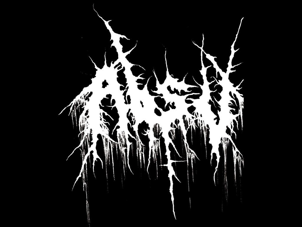
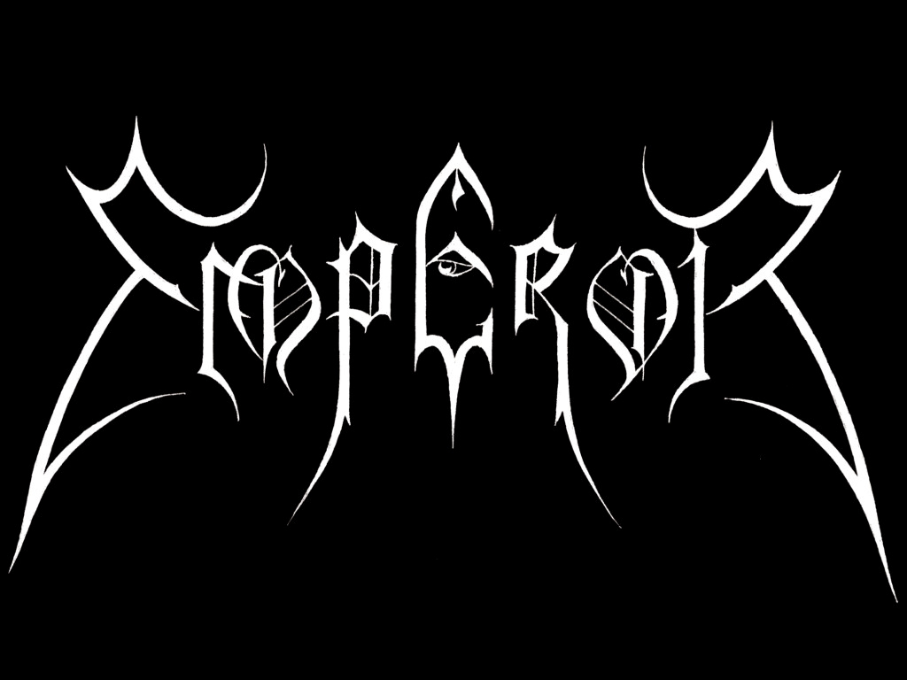
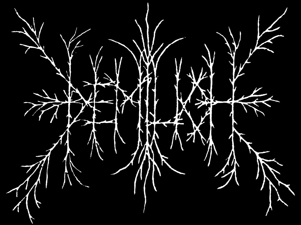
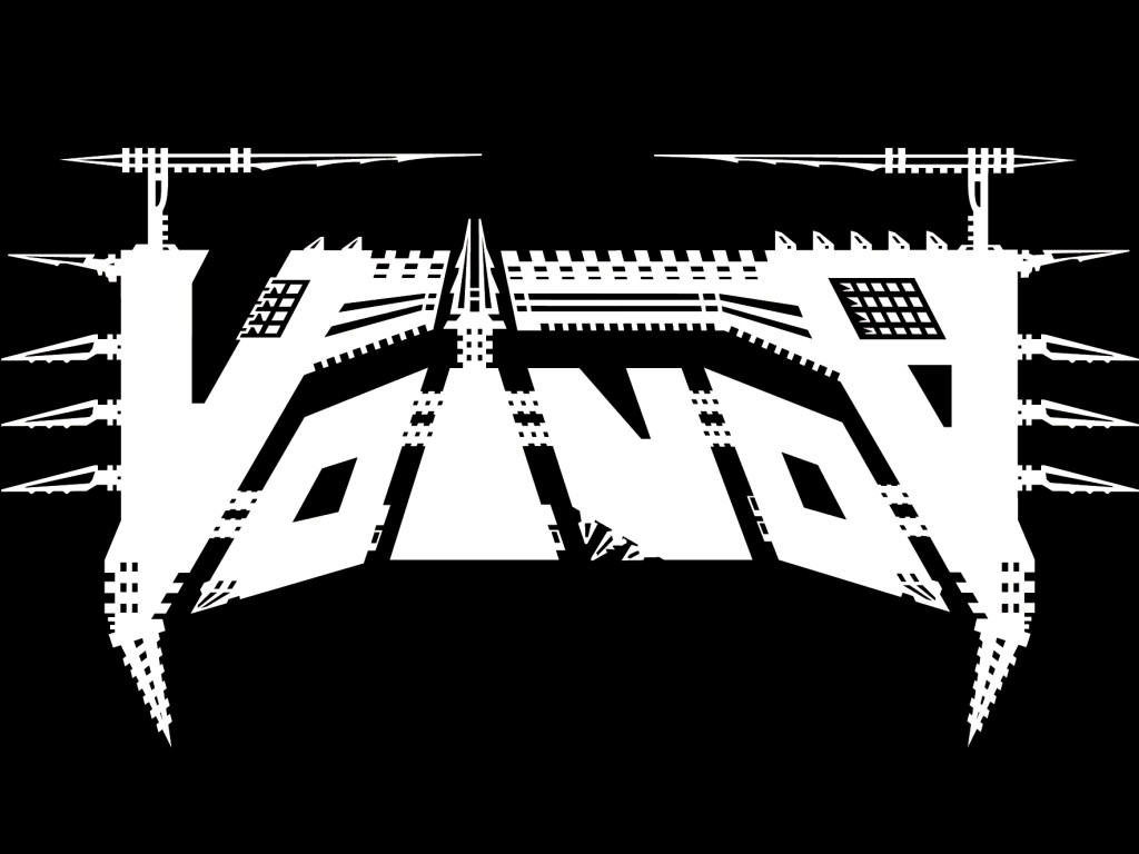
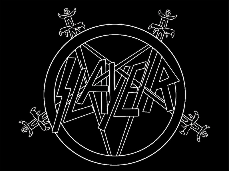
As metal evolved into myriad subgenres, each more extreme than the last, wordmarks and branding evolved in step. “Logos just tend to get more and more extreme and as you branch out,” says Riddick. It’s reached the point that you can almost determine the style of music from the typography. Indeed, there might be no better example of typography’s multi-sensorial nature than extreme metal logos. Thrash metal bands like Metallica, Slayer, and Overkill adopted logos with straight, sharp edges to reflect the tight and controlled nature of the music. Death metal bands—which tend to focus on subjects like violence, religion, horror, and, yes, death—tend to incorporate those themes into logos that feature things like dripping blood, organs, severed limbs and skulls. The logos associated with black metal, which has its roots in deeply anti-Christian views, the occult and paganism, often are ornate, symmetrical, and derived from art nouveau’s swirling, rounded forms.